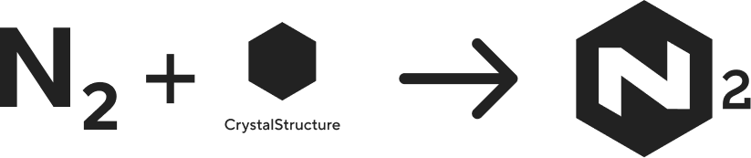
Nitrogen (N₂) is The Enterprise's core design system - a unified set of design principles, components, and guidelines that ensures every digital product we create is consistent, accessible, and scalable. It acts as the foundation for building seamless experiences across teams, products, and platforms.
Building the foundation for
Enterprise Experience Ecosystem


Scroll Down
Best-in-class Design System for Enterprise Applications
Built on Figma's Latest Design Standards
Variables, modes, component properties, and nested components — to create a future-ready design foundation.
Standardised Design Tokens
Creates a unified visual language that eliminates inconsistencies across internal applications.
Modern, Modular & Distinctly Enterprise
Designed with a clean, contemporary visual language that reflects a modern enterprise while remaining purpose-built for complex workflows.
Accessibility
Built-In
Accessibility is embedded into every token, component, and pattern from the start.
Discover
cases
The Business Context
In 2023, organization underwent one of its most significant transformations in recent years — bringing together all the entities under a single, unified business structure. The goal was simple but ambitious: to create one connected organization, capable of delivering seamless experiences for customers, employees, and partners across the organization's ecosystem.
With this new structure came a challenge — hundreds of internal applications across HR, Finance, Legal, and Corporate Affairs, each designed and developed independently over the years. These systems varied in design language, usability standards, and technical implementation. As a result:
- Multiple tools with inconsistent interfaces.
- Duplicated work to solve similar problems.
- New initiatives faced long setup.
crisis_alert
The Problem
- Multiple departments were building applications in silos.
- Inconsistent UI components and patterns across HR, Finance, and Legal systems.
- High cost of maintaining redundant UI solutions.
- Difficulty onboarding teams quickly due to lack of documentation or a shared visual language.
- Limited scalability for future products.
lightbulb
The Solution
The realization gave birth to the N₂ (Nitrogen) Design System — an elemental framework designed to standardize, accelerate, and elevate how BT Group builds its internal tools and experiences.
- A centralized design system providing reusable components, design tokens, and accessibility guidelines.
- Duplicated work to solve similar problems.
- Built with enterprise use cases in mind — scalable, secure, and adaptive to different internal tools.
Define
The Name
Nitrogen is one of nature's most essential elements - lightweight, abundant, and life-sustaining. Found everywhere, yet invisible, it quietly supports growth and function.
In the same way, the Nitrogen Design System (N₂) provides a lightweight, ever-present foundation that supports every product experience across organization. Like nitrogen's role in sustaining life, N₂ powers innovation by staying in the background—simple, stable, and vital.
The Logo
The Focus


The File Structure
To ensure scalability, collaboration, and a consistent design workflow, I structured the N2 Figma workspace into four core folders. Each folder serves a specific purpose in supporting the design system, improving team efficiency, and maintaining long-term design governance.


-
1. Libraries
This folder contains all foundational design system libraries used across the ecosystem. It includes:
- Color tokens
- Web and mobile typography
- Web components
- Mobile components
By centralizing these assets, the team can work with a unified visual language and reuse components effortlessly.
-
2. Resources
The Resources folder holds all supporting assets that complement the design system, such as:
- Icon sets
- Image collections
- Illustrations
- Logo library
These assets ensure visual consistency and make it easy for designers to access brand-aligned materials.
-
3. Ways of Working
This folder defines our design governance and workflow standards. It includes:
- Design guidelines
- File-naming conventions
- Cover image libraries
- Documentation for how designers should organize and maintain files
This ensures that every design file is structured, readable, and aligned with the broader system.
-
4. Playground
The Playground serves as a safe space for exploration and experimentation. Designers can prototype ideas, test components, and validate patterns here.
Once a component or pattern matures and meets system standards, it is promoted to the Libraries folder as part of the official design system.
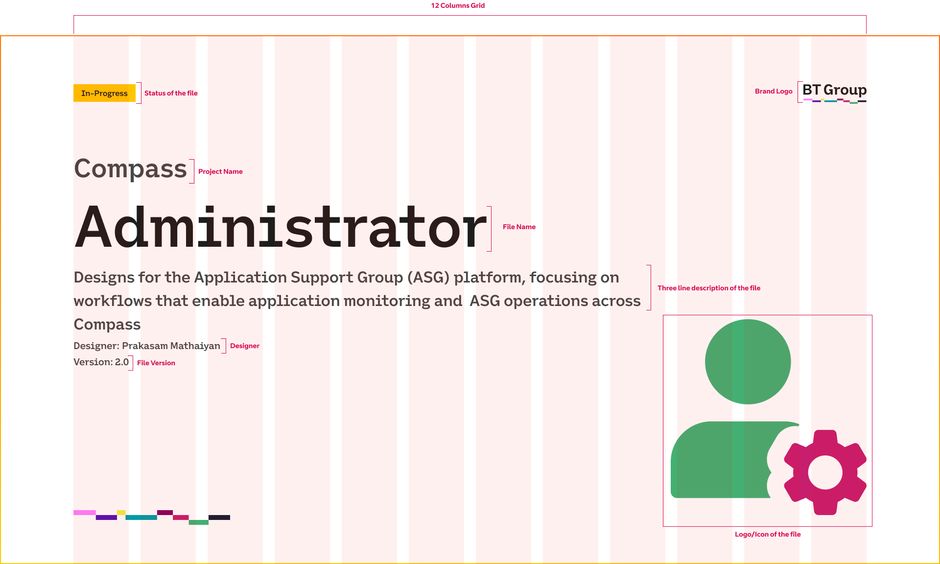
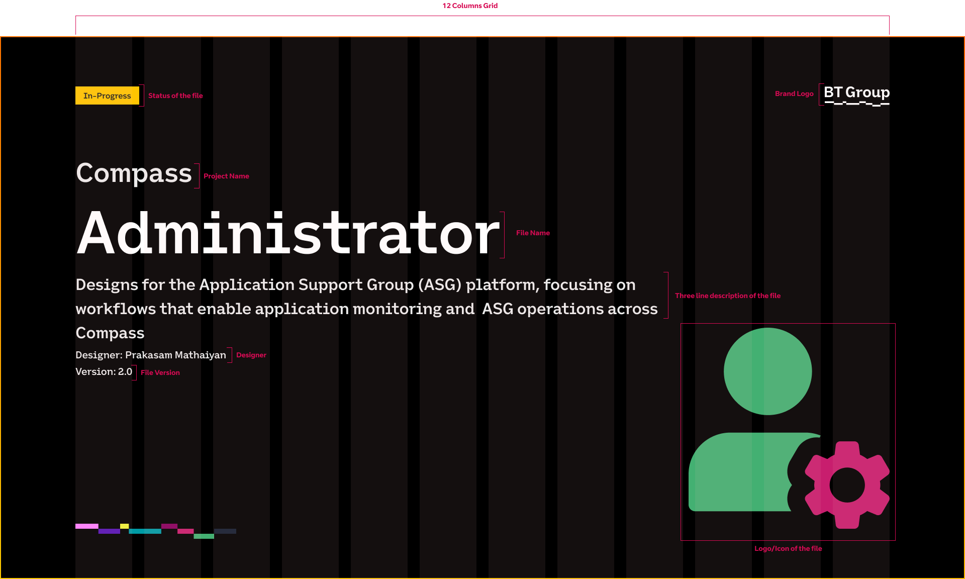
Constructing the Design file


File Cover/Thumbnail
Design
Foundation
The foundation of the N2 Design System is built to create clarity, consistency, and scalability across all product experiences. Before introducing components and patterns, it was essential to establish a unified visual and structural language that every designer and developer could depend on. This foundational layer acts as the single source of truth for the entire organisation’s digital ecosystem.
-
accessibility_new Accessibility
-
palette Color System
-
text_fields Typography
-
category_search Iconography
-
align_items_stretch Spacing & Layout
-
edit_document Writing
Accessibility
Accessibility is a core principle of the N₂ Design System, built into its foundations rather than added later.
From colour and typography to interaction, motion, and component behaviour, N₂ ensures WCAG-compliant, inclusive experiences by default. Accessibility considerations such as contrast, focus states, keyboard navigation, screen-reader support, and reduced-motion preferences are embedded at the token and component level—allowing every product built on N₂ to inherit accessible behaviour automatically.
Colour System
Semantic colour palettes define functional roles and ensure consistent, accessible UI states across all experiences.
Less is More
To ensure every color is intentional and functional, instead of building an overwhelming palette with dozens of similar shades, I crafted a precise and minimal set of primitive colours that work as the foundation for both light & dark themes. The goal was to create a palette that is simple enough to manage, flexible enough to scale, and smart enough to adapt across themes without introducing visual noise.
By keeping the raw palette lean
- The system becomes easier to maintain
- Contrast relationships remain consistent
- There is less cognitive load for designers
- Developers get a predictable, semantic mapping
One Set of Primitives, Two Themes
Instead of creating separate palettes for Light and Dark mode, N2 uses the same set of primitive variables and switches theme values through token inversion.
Example:
- A primitive like
silver 050becomes a surface colour in Light mode - The same primitive becomes a text or elevated surface colour in Dark mode through semantic token mapping

Using a precise set of primitives dramatically reduces complexity. It prevents colour inflation, avoids duplication, and keeps the design language tight. Most importantly, it ensures that light and dark modes feel like two expressions of the same visual system—not two disconnected styles.
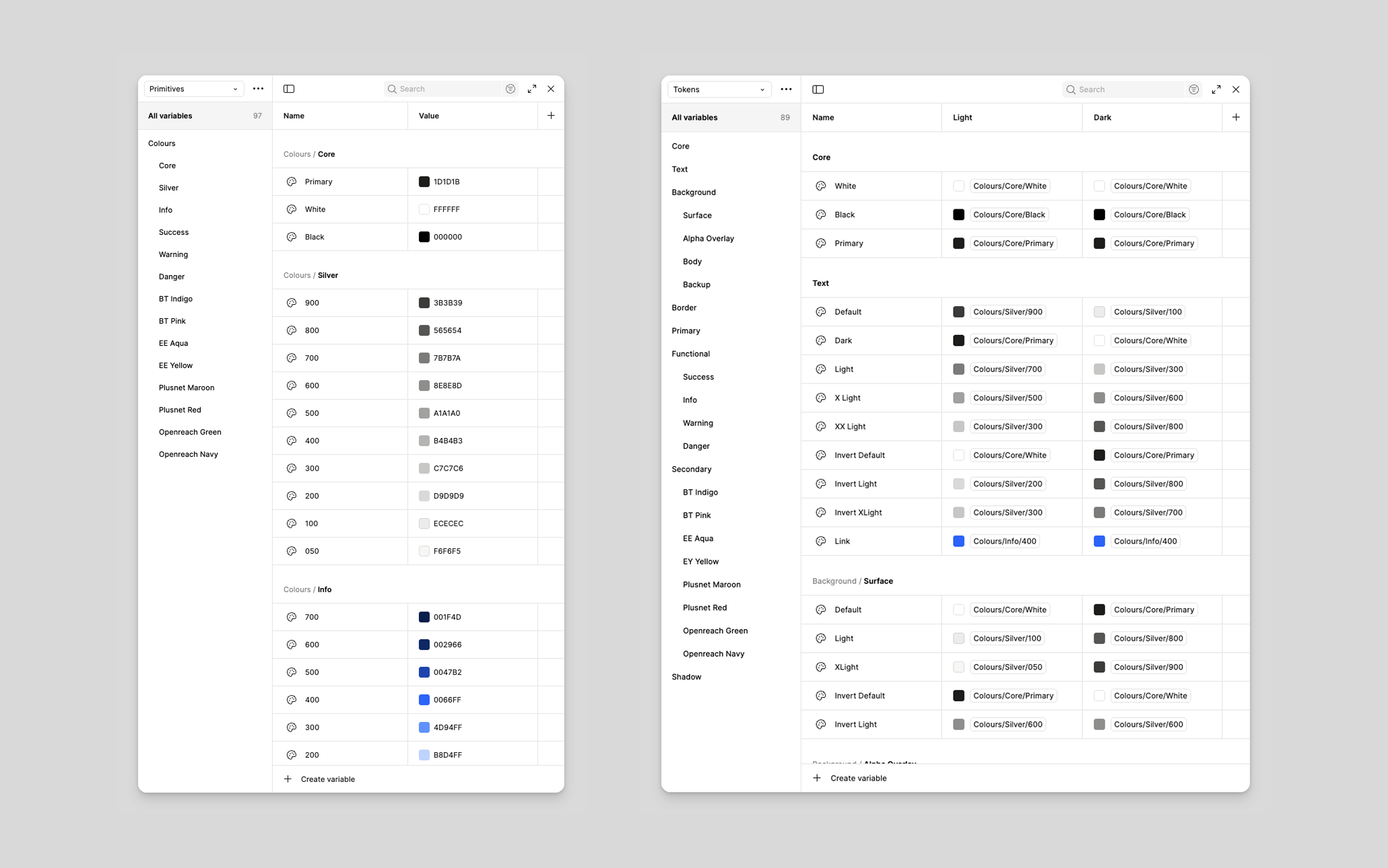
The N2 colour system is designed to be flexible, scalable, and theme-ready from the ground up. To achieve this, I built the entire system using Figma Variables arranged in two dedicated collections—Primitives and Tokens. This structure allows our system to adapt to multiple themes, maintain brand consistency, and support accessibility across products.
Primitives - The Raw Colour Library
The Primitives collection acts as the foundational palette of the design system. These are the raw, brand-agnostic colour values that form the DNA of all visual expression within N2.
Primitives include:
- Base colours
- Neutral greys
- Status colours (success, warning, danger, info)
- Supporting tints and shades
- Extended palette for illustrations or data visualisations
These values are not used directly in UI designs. Instead, they serve as the stable, unchanging source behind semantic Tokens. By separating raw colours from UI-specific roles, the system becomes easier to maintain and evolve, especially when branding or accessibility adjustments are needed.
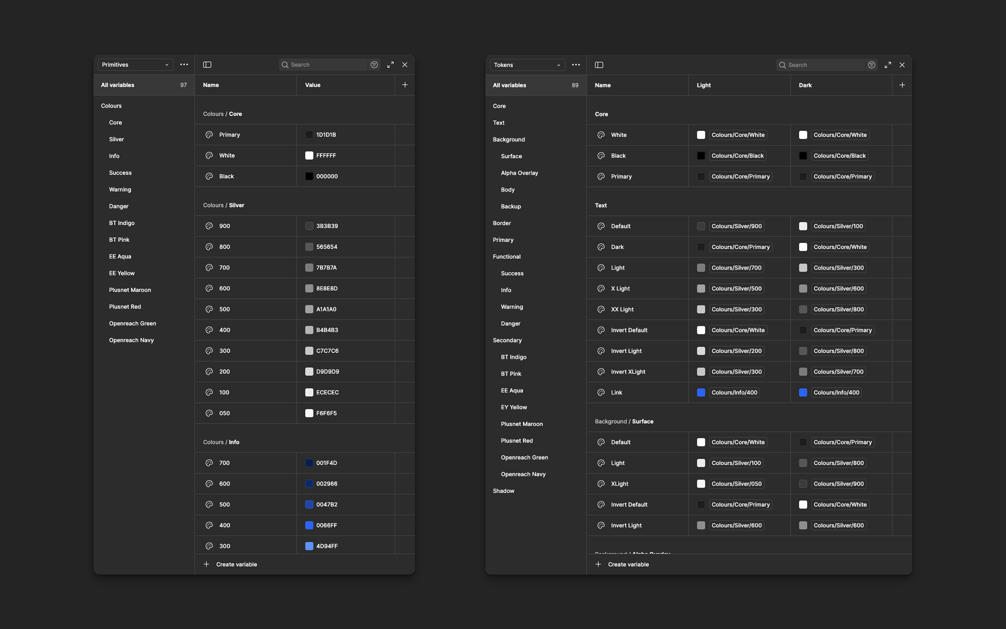
Tokens - Semantic Colours for Light & Dark Mode
The Tokens collection is where meaning and behaviour are defined. Instead of referencing raw hex values, components use semantic tokens mapped to primitives.
Example token types:
- Background / Surface tokens
- Text tokens
- Border & Divider tokens
- Status tokens for alerts, badges, and indicators
To support theming, each token is defined for both Light and Dark mode. Figma’s variable modes make it possible to flip themes instantly, ensuring that components, patterns, and illustrations adapt without rebuilding or manual override.
Why This Structure Matters
- Flexibility: Easily introduce new themes or rebrand at scale.
- Resilience: Modify a primitive, and all mapped tokens update consistently.
- Clarity: Designers choose tokens based on meaning (e.g., surface.default) rather than hunting for hex codes.
- Scalability: Multiple teams can build confidently knowing the colour language is stable and predictable.
Typography
Clear, Scalable, and Systematic Typography for N₂
Font Family System
The N₂ Design System uses a purposeful, multi-tiered font family structure that balances brand expression, functional clarity, and technical precision. Each font family plays a specific role, ensuring consistency across BT’s product ecosystem while remaining lightweight and accessible.
- Primary Font Family: This is the core typeface for N₂. It is used across most UI surfaces — including body text, forms, and navigation.
- Secondary Font Family: This typeface adds a strong Brand identity to key touchpoints such as headers, hero sections, marketing surfaces, or special communication patterns.
- Monospace Font Family: Dedicated to technical use cases like logs, system outputs, identifiers, and code-like information.
- Icon Font Family: N₂ uses Material Symbols as its unified icon font, delivering crisp, scalable icons with clean geometry, strong legibility at small sizes, and consistent use across platforms.
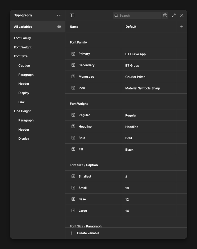
Iconography
N₂ uses the Material Symbols Sharp icon family, chosen for its clean geometry, modern aesthetic, and excellent readability at small sizes. The sharp style aligns well with the overall visual direction of the system, offering a crisp and confident look across both light and dark interfaces. This icon family also supports variable weights, and N₂ primarily uses the regular weight to maintain strong presence and clarity across various screen sizes and densities.
Spacing
Spacing and layout form the structural backbone of the N₂ Design System. Because BT’s applications are primarily enterprise tools with dense information and complex workflows, the system is built on predictable, scalable rules that help maintain clarity and usability across all products.
N₂ follows a 4-point grid system, chosen for its simplicity and efficiency in enterprise environments. This system creates a consistent rhythm that works well for data-heavy screens, forms, tables, and multi-step processes.
Why 4-point spacing works for N₂:
- It creates a clean and logical vertical and horizontal rhythm.
- It reduces cognitive load by keeping spacing visually predictable.
- It scales naturally for both compact and spacious layouts.
- It speeds up design and development alignment across teams.
Layout
The layout structure in N₂ is built on a 12-column grid system, offering the flexibility required for simple interfaces as well as complex, multi-panel enterprise screens.
N₂ supports two major layout modes:
- Boxed layout — used for focused content areas and standard application pages.
- Fluid layout — expands to larger screens, ideal for dashboards, monitoring views, and data visualization.
Left Navigation Variants
-
Full Left Navigation:
Includes both icons and labels, ideal for applications with deeper information architecture or heavy navigation requirements.
-
Icon-Only Navigation:
A compact version that maximizes screen space while maintaining quick access to key sections — commonly used in dashboards or analytics-heavy environments.
Grid Without Navigation
- Layouts adapt automatically whether a left navigation panel is present or not.
- The usable content area recalculates to maintain alignment and visual balance across all breakpoints.
Why this matters
Together, the spacing and layout principles ensure that N₂ interfaces feel structured, consistent, and scalable. Designers can build faster, developers can implement more reliably, and users can navigate BT’s enterprise tools with clarity and confidence.
Writing
Writing in the N₂ Design System is guided by clarity, empathy, and a touch of personality. Good writing helps users understand actions quickly, make confident decisions, and feel supported throughout their journey. To achieve this, we keep our content simple, human, and purposeful.
Components
Components are the heart of the N₂ Design System. They translate our foundational principles—spacing, layout, typography, color, iconography, and motion—into practical, reusable building blocks that power Organization's digital experiences. By building every component on these foundations, we ensure consistency, predictability, and accessibility across all products, no matter the platform.
N₂ components follow a modular, scalable structure. Each component is designed with real enterprise needs in mind, supporting everything from simple interactions like buttons and inputs to more advanced patterns such as tables, filters, dashboards, and multi-step workflows. Because each component inherits the same foundations, they can be combined seamlessly to build complex interfaces without losing visual harmony or clarity.
Lightweight as a Core Principle
A core principle of N₂ is lightweight construction. We use multiple levels of nested components within the design system, allowing teams to reuse smaller building blocks inside larger ones. This approach keeps the system flexible and extremely easy to maintain. When a variant or property changes at the base level, it automatically updates across all components that depend on it. This significantly reduces design overhead, prevents fragmentation, and makes the system fast to evolve as BT’s needs grow.
Components in N₂ are intentionally designed to work across different mediums and different product strategies used across BT:
Components Across Mediums
N₂ supports multiple device categories to ensure consistent experiences regardless of where users interact with our products:
- Desktop - Designed for data-rich enterprise workloads, multi-column layouts, and high-efficiency interactions.
- Mobile - Optimized for touch interactions, compact layouts, and adaptive screen behavior.
- IT Kiosks - Tailored for public or shared devices with simplified interactions, larger touch targets, and minimal navigation complexity.
This multi-medium approach ensures that our component library remains flexible while still maintaining consistent behavior and visual identity across environments.
Components Across Product Strategies
Organization delivers products using a mix of development technologies and platforms. N₂ components are designed to support all major product strategies, ensuring teams can use the design system regardless of their tech stack:
- UI Framework Components – built for React, Angular, and Flutter, supporting modern application development.
- Low-Code Platform Components – aligned with systems such as ServiceNow, SuccessFactors, and OutSystems, ensuring consistent experience even in configurable enterprise tools.
This cross-platform compatibility is a core strength of N₂. It ensures that the design system isn't limited to one type of product or technology but instead acts as a universal foundation that all teams can rely on.
Have a Design System Project?
If you're building or scaling a design system, I'd love to collaborate. Let's work together to create consistent, accessible, and impactful digital experiences.

